The Battle in the Inbox: Round 2 - Getting Engagement
The Battle in the Inbox: Round 2 - Getting Engagement
Today is the second part of my analysis of what happened when two companies used an email campaign to promote the sa...
Today is the second part of my analysis of what happened when two companies used an email campaign to promote the sa...
Today is the second part of my analysis of what happened when two companies used an email campaign to promote the same premises service to schools, but went about it in very different ways. If you’ve not seen the full infogram you can still do so by reading my previous post.
Part 1 of my analysis looked at how Company B managed to get an open rate of 36% while company A managed just 20%. Today I’ll look at how successful each email was at getting engagement from teachers; how did Company B get a much better click through rate despite their email containing 9 fewer links?
I’ve highlighted 4 key reasons for this. However, before I go further, it is crucial to remember that the ultimate goal of both emails was to generate as many face-to-face meeting requests from teachers as possible (not to try and make the sale).
1. Personalisation of content
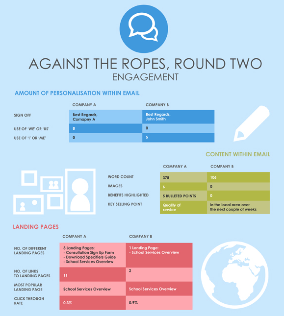
Perhaps the single biggest difference between these two email campaigns was that Company B chose a human being to front their campaign, while Company A did not (even to the extent that the sign off of Company A’s email was “Best Regards, Company A”).
Company B’s email was a very personal message from one human being to another; we counted 5 instances of the words ‘I’ or ‘Me’. Company A’s email on the other hand had no fewer than 8 references to ‘We’ or ‘Us’.
It’s important to remember that the ultimate goal of the email was to get teachers to request a one-to-one meeting at their school. Company B made the effort to start building a personal relationship through their email and therefore were much more likely to receive a positive response to their offer of a meeting.
2. Word count vs Images
As you can see Company B kept their email very simple and concise; no images and just 106 words. This in comparison to Company A who included 6 images and 378 words.
Clearly Company A felt they had to explain the benefits of their service in great detail and at some length. However, in reality this may have only served to distract teachers from the email’s purpose to generate meeting requests.
Now, I’m certainly not saying that there is no place for images in your marketing to schools emails. It’s just that the purpose of this email was simply to generate meeting requests, and the simple approach used by Company B was far better suited to this end.
3. The email’s key message
These companies were promoting a high involvement product; one that is of high capital value and will only be purchased after careful consideration. Both companies recognised that they were not going to secure a sale from this email alone.
A sale for a product such as this is far more likely to be made via a face-to-face meeting rather than through an email. It was wise therefore for both companies to make meeting requests the ultimate goal of the email.
However, having decided that the goal was to generate meeting requests, both companies needed to ensure that the content of their email was fully focused on securing that meeting. Company B recognised that, but Company A seemed to forget.
Company A’s email was focused around 5 bullet points that highlighted the key benefits of their product, while the main selling point of Company B’s email was simply that they were going to be visiting local schools in the coming days and could easily pop in for a brief meeting.
Looking at the higher click through rate Company B achieved I would suggest that the very real prospect of a meeting in the next few days grabbed teachers’ attention far better and prompted many more of them to click onto their website to find out more.
4. Links through to landing pages
Company A included 9 more links to their website within their email, and yet achieved a significantly lower click through rate. How? Well we’ve already covered this to some extent in point 3; however there is another important contributing factor.
Company A’s email utilised 3 different landing pages (pages of their website that teachers could click through to). One was a form where teachers could sign up to a free consultation, another was a page where they could download an informative brochure, and the third was an overview of their range of products and services.
The problem with this is that it gave teachers too many opportunities to be distracted from the desired path (which was to request that meeting). Company B was much more focused and channelled teachers towards the desired outcome – put simply, they made it obvious to the teacher exactly what they were required to do.
These 4 factors ensured that Company B managed to get significantly more teachers to engage with their email. Next week we’ll look at which company fared better at converting this interest into actual responses.
Tags
Emailing Teachers
Email Landing Pages
How to Sell to Schools
Email Head Teachers
Emailing Bursars
Similar Articles


VIDEO: Connecting with Schools - Selling to Schools Insights Chapter 3
Join us as we delve into chapter 3 of The State of Selling to Schools report 2023. Together we reveal what the findings show us about when to connect with teachers, why certain times are more popular and the ideal notice periods for different education business providers.


The Importance of Peer-Generated Content
Learn how to build trust and skyrocket your education marketing with peer-generated content.


Expert marketing to schools support and solutions
Expert marketing to schools solutions
Email Head Teachers, Teachers, and Staff Inboxes
Email teachers and staff inboxes
Sell More to UK and Global Schools and Colleges
Sell more to schools and colleges


