Episode 4: Typography is King
Episode 4: Typography is King
This is episode 4 in my 'Confessions of an Obsessive Compulsive Designer' blog series, and today I'll be looking at Typo...
This is episode 4 in my 'Confessions of an Obsessive Compulsive Designer' blog series, and today I'll be looking at Typo...
This is episode 4 in my 'Confessions of an Obsessive Compulsive Designer' blog series, and today I'll be looking at Typography.
Typography can make your marketing look sensational. FACT! However, like anything in marketing, it has its limitations.
Finding a font for your email copy that is widely accepted in inboxes is no walk in the park. You may be familiar with the restrictions presented by email clients; for those of you who aren’t, many fonts are specific to your computer, meaning they are less likely to be programmed into your recipients’ computers (so only a handful can be used).
So why, I hear you ask, are you suggesting the use of typography as a trend? Unfortunately for us humble marketers, we seldom dictate trends, so we try our best to use them in our favour. Here are three things to consider when implementing typography into your emails to teachers.
Availability: For body copy, choose a standard font that can be viewed across the board. If it isn’t accepted on all computers, make sure you use a standard fall-back font by implementing a similar font family.
Embed: Like photography; typography can really add impact to your email. If you don’t have imagery at hand, and are a whizz in Adobe, try embedding some colourful, fancy fonts as a graphic banner in your email instead. Here’s a design I created a while ago that uses an embedded logo font as a floating banner above the email’s content.
Character: Typography, just like imagery, can portray meaning. If you want to say something loud and strong, try a slab serif like Impact; if you want a corporate feel to your design, try including a little scripted font like an italicised Georgia; or for a contemporary feel, try Gill Sans.
Take away quick-tip: Stick to email-safe fonts in your body copy, but experiment with more elaborate typography when embedded in graphic imagery, it adds impact if you don’t have a relevant photo to hand!
The last of my Top 5 Transformative Design Trends to Try This Summer will be revealed next week. If you missed any, hurry back to the start and read them again.
Tags
Marketing to Schools
Emailing Teachers
Email Teachers
Selling to Teachers
How to Sell to Schools
Email
Similar Articles


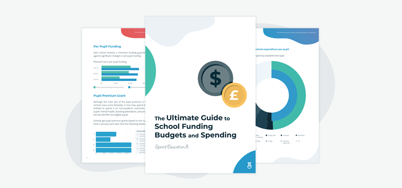
The Ultimate Guide to School Funding Budgets and Spending
Give your marketing activities an edge by understanding how school funding works, how much money they have, and when and where to target your spend.


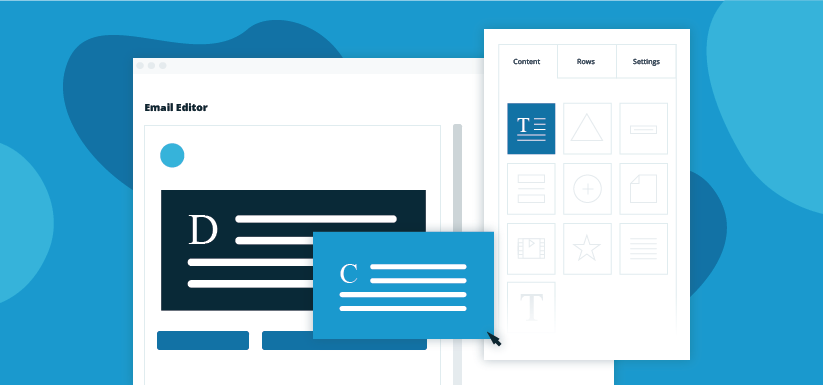
The Power of Dynamic Content in Your Edu-Marketing Campaigns
Turn a single email campaign into a hyper-personalised selling machine with the power to double, treble, even quadruple your audience base.


Expert marketing to schools support and solutions
Expert marketing to schools solutions
Email Head Teachers, Teachers, and Staff Inboxes
Email teachers and staff inboxes
Sell More to UK and Global Schools and Colleges
Sell more to schools and colleges


