


The Edu-Marketer’s Quick Guide to Email Accessibility
The Edu-Marketer’s Quick Guide to Email Accessibility
Increase your open rates, click-through rates, and reputation within schools with our free, easy tips on email accessibility.
Increase your open rates, click-through rates, and reputation within schools with our free, easy tips on email accessibility.

There’s been a hugely positive boom in inclusivity in the last few years, but amongst businesses’ hard efforts, there is one element that rarely gets discussed outside of marketing agencies’ doors. The accessibility of your emails is an important – yet easy – way to make your business activities more inclusive, and has a direct impact on your click-through percentages, response rates, return on investment – even your reputation within schools.
Not many people realise that by not following just a few simple steps, you can be intentionally excluding whole groups of teachers from your mailing lists. For example, did you know that centrally aligned text is difficult to read by those with dyslexia – approximately 10% of the UK population? And that only live text can be read by text-to-speech screen readers, meaning text embedded in an image will be missed by those with sight impairments?
Reviewing the accessibility of your emails is one of your most important tasks for this year, but don’t fret – all of the tips we’ll cover in this guide are free, quick, and easy; and will have a significant impact on how teachers worldwide perceive your emails and your brand.
What is Email Accessibility?
First, the basics. Email accessibility is the practice of ensuring your emails can be read and understood clearly by all teachers. By definition, this refers to supporting those with permanent and temporary disabilities and impairments, but poor design decisions can affect accessibility for everyone – such as using font colours or sizes that are difficult to read. Making careful considerations when it comes to all elements of your email – from the copy, to design, to code – means more teachers will be able to see your email as intended. You won’t be wasting any of your marketing budget, but there are some even greater key reasons why you’ll want to keep your edu-marketing emails fully accessible…
Why Your Education Emails Must Be Accessible:
You’ll expand your audience
Human-centric design is at the core of accessibility. Making small changes to improve the user experience of your email means more teachers can read it properly, and will think better of your emails – therefore less likely to say a permanent goodbye by hitting that unsubscribe button.
You’ll increase your click-through and response rates
Improving the accessibility of your emails means it’ll be easier for more teachers to read and interact with your email. Emails with poor accessibility can be impossible to read, or interact with. Some of our accessibility tips (that we’ll cover later) are essential for ensuring teachers can read and interact with your email. If they can’t click your CTA buttons, then they’ve got no way to visit your landing page!
Our tips are free, quick, and easy, and can make the difference between a mediocre and sky-high click-through rate.
You’ll show you care
This is a big one on the list. Not every business is aware of email accessibility, which means they can inadvertently send out emails that don’t cater towards impairments or disabilities. Of course it’s not intentional, but they can be excluding huge groups of teachers from their audience, and not creating a good impression within that community.
By going that extra mile, researching the best email accessibility tips to cater towards as many people as possible, you’re showing schools that you take steps to be inclusive with purpose, that you’re aware of a wide range of needs and will do all you can to meet them. This is particularly important if your emails are stating how your workshops are suitable for SEND pupils, or your software suite can be tailored to suit the school’s specific needs!
There’s also one very big, very serious reason that could land you in hot water…
You could get in serious legal trouble for failing to comply with email accessibility standards.
Email Accessibility Laws Worldwide
Just like the rest of your business practices, you must ensure your emails don’t discriminate against any group of people, even unintentionally.
While there isn’t a single, global law governing email accessibility, The World Wide Web Consortium, an international standards organisation, created the Web Content Accessibility Guidelines, which act as the go-to document for global accessibility standards.
In cooperation with individuals and organisations around the world, these guidelines provide a single, shared standard for web content accessibility that meets the needs of individuals, organisations, and governments internationally.
Education businesses operating within certain industries, such as financial or government organisations, will need to comply with other, more specific guidelines. Failing to comply with any and all guidelines relevant to your specific business could result in a lawsuit, should a teacher have grounds to argue unequal access.
Of course, the chances of this are incredibly slim, so they shouldn’t be your number-one priority over the actual human experience, especially if your emails are already pretty solid when it comes to accessibility. But, if you think you could make reasonable improvements, using the guidelines as a steer will not only keep you legally sound, but moreover will significantly improve the user experience for all teachers – so it’s a win-win for everyone involved.
Email Accessibility Tips: Copywriting
Text Formatting
This might seem a little obvious, but breaking up your text into snackable chunks will make it far easier for everyone to digest, as well as help highlight key information in the email. Utilising short, snappy paragraphs, bullet points, and headings and subheadings will help improve your email’s accessibility, as well as keep things looking clean and professional. The lesser-known tip here is to be careful with your text alignment. Centrally aligned paragraphs are difficult to read by those with dyslexia – which, as we learned earlier, affects up to 10% of the UK population to some degree.
This is because centrally aligned text requires your eyes to ‘jump’ around the text to find the starting point, because some lines of text will start further in than others. This is particularly noticeable with ‘widow’ words; where one or two words fall on their own line at the end of a paragraph.
From a design point of view, it’s never a good idea to mix alignments too much throughout the email; if you’re left-aligning your text for the opening paragraph, then really you’ll want to mirror this as much as you can throughout to keep everything consistent, as well as making it as easy as possible for everyone to find each element without looking all over the email.
But, there are some instances where centrally aligned text would look better in your design, in which case there are ways to make this work. By keeping centrally aligned paragraphs very short and visually balanced (i.e. just one line or two lines of roughly the same length), it’ll be much easier for teachers to locate the start of each line, and therefore have a much easier, more positive time reading your email.
CTA Text
We have a saying here at Sprint Education: your email is the invitation, and your landing page is the party. The most important piece of information for teachers to attend your party is your landing page link.
In order to get there, you’ll need to make sure your button and hyperlink text is clear. Of course, you’ll want to add some ‘pizazz’ to your email; heavily overused phrases such as “learn more” or “click here” can drastically reduce engagement and lack the excitement that drives higher click-through rates. But going too far the other way and using text that’s too vague or ‘fun for the sake of being fun’ when it doesn’t fit the situation will cause the same drop-offs in clicks.
Go for something down the middle, or, if you feel the situation calls for it, opt for a fun phrase on your button, then add some sub-text underneath to add clarity to the destination. For example, your email advertising school ski trips could feature the text “Slide on over” on your main button, with the subtext ‘visit our website’ underneath to add context.
Subject Lines
As we all know, your subject line plays a huge role in the success of your email. It’s the key to getting teachers to open your email, and can make or break even the greatest of email campaigns. The key element of an accessible subject line is its length. Desktop email clients such as Outlook only display approximately 60 words of a subject line in the preview pane, and mobile email clients roughly 40. The subject line will be seen in full when you actually open the email – which of course is too late if a teacher has decided not to open the email based on those limited characters. To get around this, you’ll need to make sure the clear, important information is at the start of the subject line, and anything less-important (but still mighty enough to make to to the subject line) follows up the end.
One of the biggest rules here is to keep any merge tags at the end of the subject line. Inserting the teacher’s name or the name of their school could easily take up most of those 40 characters alone, meaning the rest of the subject line – which could unearth something incredible, like a freebie or voucher – would be cut off. Instead, keep the merge tags to the end of the subject line, and open with the wow-factor – “Free KS2 science resources for %%teacher_name%%”, for example.
Email Accessibility Tips: Design
Dark Mode
Dark mode is a display setting available on both mobile and desktop devices that reverses on-screen colour schemes, primarily to reduce eye strain in low-light conditions, but also to make your content easier to read by teachers with cataracts or related disorders. However, not everyone will find dark mode easier – teachers with conditions such as dyslexia and astigmatism may struggle to read light text on a dark background, for example.
When dark mode is enabled, various email clients will either completely invert, partially invert, or do nothing to your email. This can prove problematic when designing your email, as you won’t have a solid idea of how your email will render across different email clients.
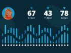
However, in 2019, research revealed that a whopping 95% of people prefer dark mode, so it’s not something email marketers can ignore. The only way to check the impact of dark mode across all clients is to thoroughly test on as many devices and email clients as possible.
Colour Palettes
Choosing complementing colours isn’t just vital for a professional, inspiring, on-trend design: it’s essential for making sure your email is fully accessible. Certain colour combinations will make your email difficult for anyone to read, but those with poor vision or colour blindness will find other colours and combinations just as difficult. For example, if you’ve used white text on a bright yellow background, and you can only ‘just about’ read it, it's likely that plenty of other people will struggle, or won’t be able to at all.
The Web Content Accessibility Guidelines outline minimum contrast ratios, so it’s a good idea to consult these when putting together your business’ brand guidelines to avoid having to change your colour palette later on.
Fonts
It’s not only the colour of your fonts you need to consider – it’s the actual font family and size, too.
While it can be tempted to choose a jazzier font to make your email stand out, there’s a reason the likes of Arial and Open Sans are so popular – it’s because of how clear and easy they are to read. They’re also web-safe and email-safe, meaning they’ll appear in your email. Lots of the more out-there fonts don’t fit into these categories, meaning they won’t work in your email, and teachers will see a fall-back font instead. This takes away some of your control over how the text appears, meaning your fallback fonts could end up too small or otherwise too difficult to read.
In terms of size, there’s a fine balance between going too big (which can look more unprofessional) or too small (which is difficult to read). You also have to contend with spam filters, again, as overly large or small text can be picked up by spam filters.
Embedded Text
As we’ve covered, text embedded in an image can’t be read by text-to-speech screen readers, meaning you’re cutting groups of teachers off from potentially important information.
It’s also not a good idea to embed too much text in an image, because, like with other techniques, it’s been adopted by spammers to try and ‘hide’ unsavoury text from spam filters. In recent years, spam filters have become incredibly clever and can now combat this to some degree by recognising certain pieces of text and words in images. Too much text in an image can therefore be flagged by spam filters, and cause your email to land in teachers’ junk folders.
It’s not to say you can’t use limited amounts of text in an image, as long as you keep it to a bare minimum, and try and avoid putting important text such as dates and times in the image. You’ll then just need to include alt text behind the image for the benefit of assistive technology, and we’d strongly recommend also including this text in your live body copy somewhere for those that aren’t using screen readers, but can’t or don’t download your email’s images.
Email Accessibility Tips: Coding
Alt Text
Alt Text is one of the most important bits of code you’ll need to add in before sending your email. Alt text is a short description of text that sits behind images in your emails. This means that if teachers don’t download images (some school networks block these for security purposes), or if they’re using a text-to-speech screen reader, they’ll get an idea of what your images were conveying.
Now, there is a fine line when it comes to alt text. In an ideal world, we’d give every image a quick explanation – such as ‘children playing on the playground’ or ‘man typing on a computer’.
Unfortunately, alt text has been adopted by spammers to ‘hide’ unsavoury code, texts, or hyperlinks in an email to try and bypass spam filters. As a result, using too much alt text in an email can cause spam filters to flag your email as spam.
To get around this, all emails designed by Sprint Education will only ever utilise alt text behind text embedded in an image. As we’ve covered, this can’t be read by text-to-speech screen readers because it’s not ‘live’ text; it’s simply an image. We therefore copy this text into the alt text, which means that anyone unable to view images can still get the core details through alt text.
Hyperlink Colours
If teachers are viewing your email with images turned off, any images that contain a hyperlink will just display the plain hyperlink in the email. This is great for your click-through rates, as it keeps multiple paths to your landing page open. But, you’ll need to make sure you set an appropriate link colour for these hyperlinks. For example, if you set the link colour as blue, but the image was sat on a blue background, the link will end up invisible. In the same vein, a light pink link on a red background won’t have enough contrast to be read easily by those with sight impairments.
You’ll need to make sure whatever link colour you set stands out against the background colour, with enough contrast to be easy to read.
Plain Text
When creating any HTML marketing email, you’ll always want to include a plain text version alongside. Plain text emails aren’t to be confused with the personalised, one-to-one style marketing email we often use as part of your edu-marketing strategies. These plain text versions are simply a stripped-back version of your designed email; they contain no images, buttons, or design elements – just your text and raw hyperlinks.
Teachers using assistive technology may prefer to view the plain text version instead of the full HTML design because it’s easier to read and process, and allows them to focus solely on the vital elements of the email.
Here at Sprint Education, we never send an email without creating your full plain text version for you. And if you’re using our selling-to-schools software, Campus, you’ll be unable to send an email until you create your plain text version, so you’ll never forget.
What Next?
If you’re ready to put these tips into practice, arrange a no-obligation demo of Campus with our experts. Our selling-to-schools toolkit puts you in control of your marketing, with a full email design and testing suite to help ensure your emails are fully accessible for your whole teacher audience.
Or, if you’d prefer an expert hand to help with even more of our accessibility insights, book a free strategy call with our industry experts. We can manage every aspect of your campaign – from planning, to creation, to send – and ensure your emails not only look top-notch, but also stand out from the crowd with our top accessibility techniques.
Simply click the links above to begin, or alternatively get in touch with us anytime on info@sprint-education.co.uk or 01684 297373.
Tags
Design
Email
Email Design
HTML Email
Marketing
Similar Articles
Building a Landing Page That Teachers Love
Learn how to capture teachers' interest within 5 seconds of them reaching your landing page.

Expert Tips on School Sales Success Before the New Year
Video insights on standing out this November and December from our education marketing team


Expert marketing to schools support and solutions
Expert marketing to schools solutions
Email Head Teachers, Teachers, and Staff Inboxes
Email teachers and staff inboxes
Sell More to UK and Global Schools and Colleges
Sell more to schools and colleges
