Emailing Teachers: Just How Hot is Your Content?
Emailing Teachers: Just How Hot is Your Content?
When it comes to marketing we're all skim-readers. So, what does this mean for you when you're emailing teachers?
When it comes to marketing we're all skim-readers. So, what does this mean for you when you're emailing teachers?
The most important thing to remember when emailing teachers is that a lot of what you write will not be read.
If that sounds like a slightly deflating note on which to begin this blog then I’m sorry, it’s not meant to be. It’s just meant to focus your mind on getting your most important content in the right places when emailing teachers so that the bits that are read still tell a coherent and engaging story.
This is something that we do a lot of research on at Sprint Education. We know that teachers are busy people. We know that they don’t have time to savour every last morsel of your exquisitely crafted copy. Therefore, we know that we have to make your marketing to schools snackable.
Snackable emails are those that can be scanned by a busy teacher and still get the job done. Below is a really nice example of emailing teachers with snackable content. We designed it recently for our client, School Reel, and I’ve overlaid a heat map of where our research tells us teachers’ attention will be most drawn:
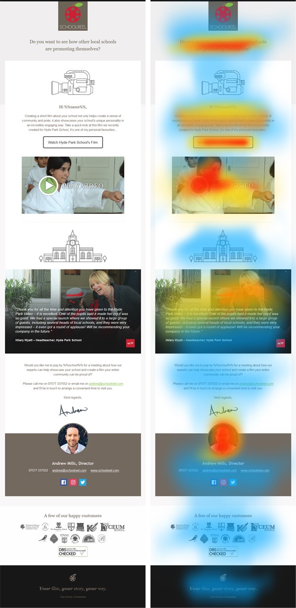
Crucially, the first thing to notice is that the email header and the call to action (the part of the email that contains the link you really want teachers to click on) are by far and away the areas that draw the most attention. In contrast that opening paragraph, which our copy writer, Dan probably spent ages fine-tuning, doesn’t register anywhere near as much interest.
This tells us one incredibly important thing about emailing teachers. It tells us that the email header and the call to action must work together as a team, almost like a beach volleyball team; with one setting up the ball so that the other can smash the winner! They have to make sense even though the teacher may not have read the text in between.
That’s what I love about the email design above; the header is the question ('Do you want to see how local schools are promoting themselves?') and the call to action is the answer ('Watch Hyde Park School's film'). Even though the text between is pretty sweet (nice job Dan, don’t feel downhearted) it’s not essential.
The second interesting thing to notice is how teachers’ attention is also heavily drawn to the signature area of the email, which tells us that they are looking to find out more about the people behind the message.
My colleague, Jackie wrote a blog a couple of years ago (Email Marketing: It’s About the Shoes, Not the Hair!) about how important a friendly and professional signature is when emailing teachers. It’s an area that our Design Team put a lot of effort into as we know this is where teachers will look when they want to get a glimpse of the real you – and we all know how important a good first impression is.
And it’s not just your design-style emails that you need to make snackable. Even those plain text, highly personalised emails that you send to teachers need to take into account the very same principles.
Take a look at this plain text email we wrote for our client, Supply Register recently. Again I've overlaid a heat map so that you can see where teachers' attention will be drawn:
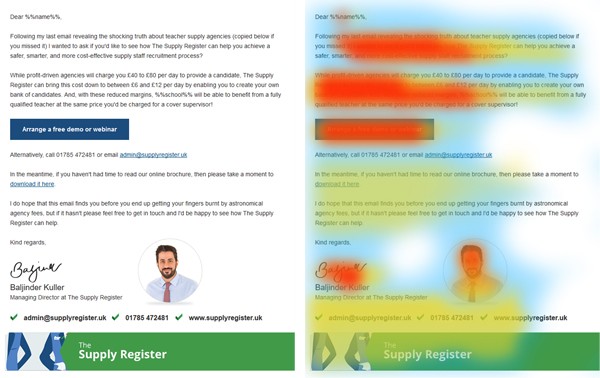
As with the design for School Reel, you can see how much attention that call to action button gets. With a plain text email like this it’s tempting to bury your call to action amongst the copy, however you can see from this example just how important it is to give it its own eye-catching section when emailing teachers. If it had been buried in the final paragraph it would barely have been noticed.
You can also see how teachers will tend to skim read the opening paragraphs so you need to make sure you get the most important information at the top of your email and to the left hand side if possible.
So, the next time you're emailing teachers make sure you cater for the fact that not all of it will be read. Think carefully about the format of the email and make sure your most important information is where it’s most likely to be seen.
Tags
Email Marketing
Email Teachers
Marketing to Schools
Selling to Schools
Similar Articles


An Overview of the 2022 Exam Season
Read our 2022 exam cheat sheet, and find out what’s different about this year’s exams, and what you need to do to hit top marks during this period.

Marketing Charities and Fundraisers to Schools
Learn 10 game-changing insights to encourage schools to fundraise for your charity and enhance your education marketing campaigns when emailing schools.


Expert marketing to schools support and solutions
Expert marketing to schools solutions
Email Head Teachers, Teachers, and Staff Inboxes
Email teachers and staff inboxes
Sell More to UK and Global Schools and Colleges
Sell more to schools and colleges


