


Marketing to Schools Through the Ages: The Evolution of Our Logo
Marketing to Schools Through the Ages: The Evolution of Our Logo
The story of how and why the Sprint Education logo has evolved over the last 10 years
The story of how and why the Sprint Education logo has evolved over the last 10 years

![]()
In our humble beginnings, Sprint Education operated from the dining room of the founders' father. Wide-eyed and full of promise, the two keen brothers set about changing the face of marketing to schools.
With the brothers’ skill sets spanning both education and marketing they were armed with some pretty powerful tools to help their prospective customers effectively email teachers and educational staff across the UK. But first things first, they needed a logo!
They wanted a visual identity that made it overtly obvious what they specialised in. Their first stop was to look at the latest trends in logo design, and it seemed companies had taken to displaying their company name in lower case.
After a few hours in front of an early release of Adobe Photoshop, the boys had created their fledgling company’s first logo. The visual appearance of Sprint Education’s brand was born!

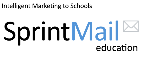
For a more professional finish the boys later decided to readjust the lowercase wording for titlecase along with the addition of the word ‘education’ (our specialist subject if you’re asking John Humphries). The blue hue of the ‘Mail’ wording was also tweaked to give it a more vibrant and fresh feel. That wasn’t the only reason though, the boys did their homework! In colour psychology, blue is regarded as a trustworthy colour which also suggests strength. (The boys were still pretty keen on that envelope though so that made the cut.)
With the rise of skeuomorphism in design trends the next iteration of the Sprint Education logo saw a glossy sheen and reflection added to a new, stronger san-serif, typeface. What’s more, we lost that darn envelope and brought in our more dynamic company mascot ‘Basil’.
For those of you who don’t know: Basil is named after the boys’ late Grandfather (a strong-willed and determined man who always encouraged the boys to better themselves and help better the lives of others). Sprint Education’s values are closely aligned with his life values so it seemed the obvious name for our mascot.

A few years later it seemed that following trends wasn’t working for Sprint Education’s visual identity. Design had moved on and skeuomorphic design seemed a little ‘old hat’.
It was around this time that I joined Sprint Education as the new in-house designer so I began looking to the forefathers of logo design to inspire me in the creation of a logo that would encapsulate our friendly and energetic brand personality, while avoiding a design that would prematurely date.
I researched designers of timeless logos such as Alan Fletcher and his V&A and Reuters logos:
 (Image source l-r: http://archive.wolffolins.com/work/va?ghost=1#, https://stocklogos.com/topic/alan-fletcher-archive)
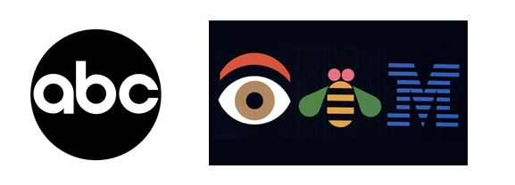
Paul Rand and his ABC and IBM logos:
 (Image source: http://www.logodesignlove.com/all-about-paul-rand)
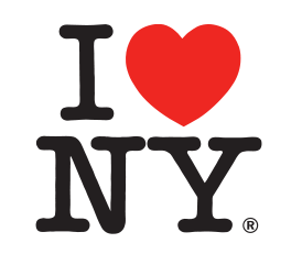
Milton Glaser and his I Heart NY logo:
 (Image source: https://en.wikipedia.org/wiki/I_Love_New_York)
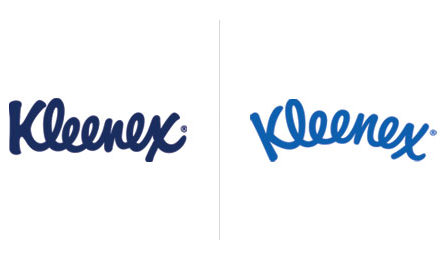
And finally Saul Bass and his logo for Kleenex.
 (Image source: http://www.logodesignlove.com/saul-bass-logos)
With just a small tweak from Sterling brands in the late noughties, this logo has lasted well over 20 years.
Something each of these designs have in common are their unmistakable simplicity and two-dimensional flat colour appearance. This historical research, along with the popularity of more brand interactions taking place on smaller screened devices, meant that flat colour logos seemed the obvious choice for the new Sprint Education logo.
To highlight personality and energy, I opted for a handwritten font like brands such as:
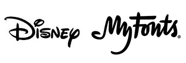 (Image source l-r: http://logos.wikia.com/wiki/File:Disney_Logo.png, http://www.underconsideration.com/brandnew/archives/myfonts_gets_a_myredesign.php#.WBHJniR5JM4)
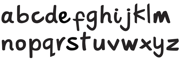
Rather than buying a font, I crafted a custom font to echo Sprint Education’s unique voice, which was based on the fluidity of handwriting. This helped emphasise Sprint Education’s human personality and friendly, energetic approach to selling to schools.
Our brand mark, Basil, needed a new look, his current style was looking a little too much like a stock image. There are many brands who use a mascot as their logo mark, so I did some research to find some effective ones.
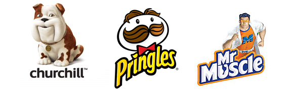 (Image source l-r: https://en.wikipedia.org/wiki/Churchill_Insurance, https://en.wikipedia.org/wiki/Pringles, https://en.wikipedia.org/wiki/Mr_Muscle)
Basil was given an abstract re-fresh. Using a simple, but chunky, line drawing made him more memorable and friendly.

After a long stint as ‘Sprint Mail’, our founders adapted the name to ‘Sprint Education’: a name that is closely aligned with our specialist market sector. Using black and a highlight of blue separates the wording and highlights the key word ‘education’.

Since its reincarnation, the logo has only undergone one minor tweak this year; that is to adjust the blue colour to match that in our new brand guidelines, and slim the type thickness down slightly to make it even easier to scale down on printed and digital media without the line strokes overlapping.

Take away tips
-
Find a colour that aligns with your values. (https://thelogocompany.net/blog/infographics/psychology-color-logo-design/)
-
Choose a typeface that emphasises your brand voice.
-
Don’t follow trends, but define a simplistic style for longevity.
-
Use your logo mark to add personality.
Tags
Education Marketing
Email Teachers
Marketing to Schools
Schools Database
Selling to Schools
Similar Articles

The State of Selling to Schools 2023
Read the third edition of our groundbreaking report, and get essential education insights from 5,870 teachers to help you sell more to schools.

Selling to Schools 101: The Ultimate Guide
Go from novice to pro with our education marketing guide designed to unlock success for your selling-to-schools solution.


Expert marketing to schools support and solutions
Expert marketing to schools solutions
Email Head Teachers, Teachers, and Staff Inboxes
Email teachers and staff inboxes
Sell More to UK and Global Schools and Colleges
Sell more to schools and colleges
