


Emailing Teachers: 50% of Are Now Opened On Mobiles
Emailing Teachers: 50% of Are Now Opened On Mobiles
In this blog, Sophie explains why it's so important to think mobile when emailing teachers.
In this blog, Sophie explains why it's so important to think mobile when emailing teachers.


Once in a blue moon an event or innovation occurs that will blind-side your business, maybe even your whole sector. We’ve experienced a few over the past decade when it comes to emailing teachers, but none more seismic than a trend that is gathering momentum within schools every day.
It’s something we all do and it is generally harmless (except when driving) - it’s people's increasing tendency to open and read their emails on their mobile device.
Now, when planning your email designs and strategy, as an education business you would be forgiven for thinking that teachers rarely use mobile phones during school time to check their emails, so why would this affect you?
Well trust me they do, and it affects you hugely!
In recent years more and more teachers have started viewing their school inbox emails on a mobile device during lessons, lunch breaks, and actively during evenings and weekends.
(We’ve recently executed a bear of a research project looking into the detailed data behind emailing teachers; specifically the devices they are using. The findings were staggering! We will be publishing this report and sending it to you soon.)
However, you still may be wondering how this affects you. Well here comes the blind-siding!
If a teacher chooses to open an email you send them on a mobile device then there is a good chance that the email will look different, and sometimes even broken if you do not build the email in a responsive format.
The cold hard truth is that teachers could be receiving a jumbled up mess of text and images, not the beautiful email you painstakingly spent hours designing. I don’t need to tell you how bad this is on your marketing engagement levels, lost sales, and even damage to your brand. Luckily for our clients' campaigns we've always designed mobile aware or responsive designs so they present themselves correctly to mobile viewers.
So what’s happened to the good old fixed width email?
Before the rise in the use of mobile devices, email design was a happy place. HTML was sturdily structured in a fool-proof fixed width arrangement. Designers across the world could frolic freely in the comfort that when emailing teachers their emails would be viewed on gloriously full-sized computer monitors. They had full reign to create elaborate visuals without worrying too much about rendering issues. Multiple columns were a breeze and ornate entwined graphics were, well… bliss! But, like all good things, this style of HTML came to an end (SIGH).
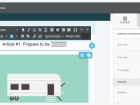
To continue this approach today causes a few issues when viewing this kind of email on those pesky smaller screened devices. Who hates having to painstakingly pinch and scroll horizontally to read email content? That’s right, the vast majority of us. To show you just how cumbersome this kind of HTML can be, here’s a design that we created a few years ago with a fixed width traditional layout.
Today, mobile devices would render this design almost impossible to read at first glance. The outer cells (light grey areas) are imaged based and unresponsive; and the playful graphics reside outside of the main content table (the white area) hindering the reader’s UX (user experience) by making it just too difficult to decipher.
So what can you do to solve this problem?
You must adopt either a mobile-friendly design, or preferably a responsive design when emailing teachers. (At Sprint Education we offer both of these two approaches to help improve our clients’ email UX.) But it is the responsive design option which is the important one here.
You may well have witnessed the trend in responsive email design lately, and you may have heard the term ‘responsive’ banded about in marketing circles.
What are responsive emails?
A responsive email has the ability to adapt its format and layout dependant on the viewing screen size/device, so that a viewer sees the email in a suitable layout to help enhance engagement.
Responsive design tends to be structured in a modular format. This means an email’s content is housed in stackable modular blocks (a little like Lego). On a desktop client the email will look pretty much the same as a standard fixed width design, but on a smaller screened device, the modular blocks can re-order, and stack vertically on top of one another.
With mobile use on the rise in schools, the need for content that is easy to navigate and interact with is paramount, so having content that is within clear segmented modular blocks makes this possible!
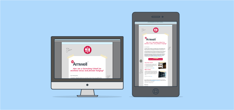
The following email is a prime example of a responsive modular design. Take a look at the HTML version here and don’t forget to flex your window to witness its full glory!
So is there a solution for non-email experts and marketing departments?
In some cases over 50% of all emails to teachers were opened on a mobile device! So for those of you that do not use Sprint Education to create your emails and manage your edu-marketing you might need to learn how to design/build responsive emails pretty sharp-ish!
(This is not an easy task! The investment Sprint Education has had to make to ensure its Coding Team and emailing software is at the forefront of this email revolution is sadly a luxury most marketing/design departments do not have).
However, there is a simple answer!
As part of Sprint Education’s investment we have also redeveloped the Email Marketing Module within Campus (What is Campus? Learn more), so it is now a brand new Drag 'n' Drop Responsive Email Builder.
Launched only in the last few days to Campus’s current users this email builder is not only super-simple to use, and totally cutting-edge, but it's also going to change your whole ability to ensure that you're emailing teachers in a way that they can appreciate your lovely emails regardless of the device they are viewing them on.
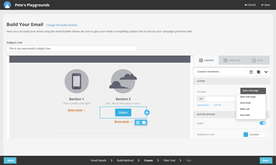
If you create a Campus account you can now take a firm grasp of your email marketing to teachers and schools, even if you are not an email coding expert.
With Drag 'n' Drop you've got the tools and flexibility to build emails that only the most seasoned email pros could have dreamt of building before... in minutes... with no training!
If you would like to chat with one of our Team about Campus please call 01684 297374 and we’ll be happy to help.
Tags
Email Design
Email Teachers
Marketing to Schools
Selling to Schools
Emailing Teachers
Similar Articles
Marketing Education Resources to Schools
Learn 10 game-changing insights especially for education resource providers to enhance your education marketing campaigns when emailing schools.

What Type of Education Business Are You?
We identified three distinct types of education business last year. Here's how their approaches to the pandemic have played out in 2021.


Expert marketing to schools support and solutions
Expert marketing to schools solutions
Email Head Teachers, Teachers, and Staff Inboxes
Email teachers and staff inboxes
Sell More to UK and Global Schools and Colleges
Sell more to schools and colleges
