Create your most clickable email yet
Create your most clickable email yet
Now's the perfect time to consider your marketing strategy for the year ahead.
Now's the perfect time to consider your marketing strategy for the year ahead.
With just a couple of weeks left of the decade, it’s the perfect opportunity to consider your marketing strategy for the year ahead before downing tools for a couple of days filled with mince pies and Christmas special repeats.
In our last blog, we looked at the reasons why you should vary your approach when emailing schools, but now you’re staring at the blank page in front of you wondering exactly how to do that.
The fear of the blank page. You know you’re going to send an email. You know what you’re offering. However, putting the words down on a blank document can sometimes feel like constructing a puzzle with no corner pieces and no cute and fluffy picture of kittens to guide you. So, let’s take a look at an example.
Your next high-impact email
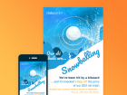
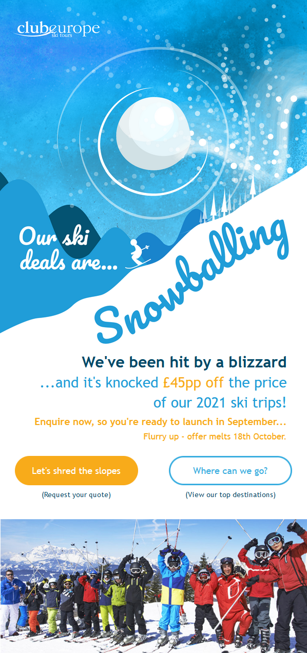
The aim of this campaign was to offer a discount for early bookings. To kick off the campaign, we decided to begin with a short, high impact email. Everything in this approach is designed to grab the readers’ attention and encourage them to click through to the landing page.
Why this approach?
• Short attention spans
We know that when opening emails, teachers spend eight seconds on desktop and just two seconds on mobile before deciding on an action to take, whether that’s reading on, clicking through, or deleting the email. As disheartening as this can sound, it shows how crucial that first impression is. You can read more about these stats in our report - How Teachers Are Viewing Your Emails.
• Increasing use of mobile devices
In the same report, we discovered that mobile engagement has overtaken desktop engagement for the first time when emailing schools. Think of the last time you tried reading an essay on a mobile phone. Never? That’s because it’d be a pretty difficult task. This increase in mobile engagement makes it even more important to keep copy ‘snackable’ and easy to read on a small screen.
• Make the big introduction
If you’re introducing a new brand, a new idea, or a new offer, this approach highlights that without anything else cluttering up the email or diverting attention. We wanted this email to really zero in on one idea, the early-bird discount. Yes, later in the campaign we might want to draw attention to the variety of services provided amongst a raft of other benefits, but in this case, the aim is clear.
With this in mind, we built this email to:
• Intrigue, not explain
As tempting as it can be to tell teachers every single benefit and feature of your product or service, this can be a difficult thing to do concisely. When taking the short, impact approach, it’s best to simply tell the teacher why they should care with a high impact sentence or a statistic to grab their attention and intrigue them enough to click through to learn more.
• Grab attention with an eye-catching design
There are no long paragraphs to be digested here! The image, headline, and call-to-action are the stars of the show. The image playfully draws our readers’ eyes down to the key information about the offer. A great design will make your message memorable. A good rule of thumb for an impact approach email is to combine roughly 60% image and 40% text.
• Focus firmly on the CTA (call-to-action)
The goal of this email is not to educate the audience about your product or service. The goal with this approach is to make an impact and get the audience clicking that CTA. Using a different approach, we could have included much more detail in the email about the top destinations or even included pricing information within the body copy. Rather than overloading this email with all that information though, we’ve stuck to the approach and encouraged click-throughs.
• Consider the landing page
Crucially with this email approach, your landing page should be informative and should fill in the blanks left by the email. So all those other need-to-know bits of information should be easily available or navigable from the landing page. In this example, readers are likely to want to know about the company and more about the offer before they book. It’s crucial that this information is easy to find from the landing page. Otherwise, a click-through could easily be wasted.
Keep these points in mind when you begin your next strategy and you should be on your way to creating your most clickable email yet. Just remember, once you’ve perfected this approach, don’t get lazy! This approach, although highly effective, could become stale if overused. So keep changing things up – jump back to our last blog to review why you should be varying your edu-marketing approach.
Merry Christmas and enjoy those mince pies!
Tags
Education Marketing
Email Marketing
Email Schools
Similar Articles

How to Sell to Multi-Academy Trusts
Understand one of your businesses' ultimate decision-makers, and the key periods within the academic calendar to reach them with your edu-marketing.

The Top 3 EdTech Needs in Schools (and How You Can Transform Teachers' Lives)
Revealed: What teachers think are the main benefits of EdTech and how you can engage with their key needs.


Expert marketing to schools support and solutions
Expert marketing to schools solutions
Email Head Teachers, Teachers, and Staff Inboxes
Email teachers and staff inboxes
Sell More to UK and Global Schools and Colleges
Sell more to schools and colleges


