Campus: 3 more features for the Drag ‘n’ Drop email builder!
Campus: 3 more features for the Drag ‘n’ Drop email builder!
After our recent upgrade to Campus’s Drag ‘n’ Drop builder, we’ve introduced three more awesome features and tools to design incredible edu-marketing emails!
After our recent upgrade to Campus’s Drag ‘n’ Drop builder, we’ve introduced three more awesome features and tools to design incredible edu-marketing emails!
Following our recent version upgrade to Campus’s Drag ‘n’ Drop builder we’ve improved the software twofold and introduced three more awesome features and tools for you to jump into your account and start using straight away.
Drumroll please…
The three new functions include:
- Mobile or Desktop Specific Content
- Mobile Stacking
- Row Background Images
1. Mobile or Desktop Specific Content
With our recent ‘The State of Teachers Emails’ report showing that 50-60% of teachers are consistently opening emails on their mobile phone, we wanted to bring some functionality to the builder that allows you to further tailor your content to an ever-growing audience of mobile teachers.
With that in mind, you now have the ability to decide whether specific content in your marketing email is visible on only mobiles, on only desktops, or on both:
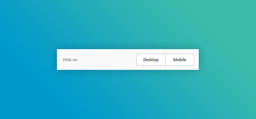
The report also showed that 65.4% of teachers opening their emails on a mobile device are reading for longer than 8 seconds, compared to the 53.2% of teachers opening on a desktop. Putting this new function into practise, you might decide to make your desktop email a little shorter to allow for a shorter reading time, while your mobile version can be a little longer and show additional click-worthy content.
2. Mobile Stacking
Previously in the Drag ‘n’ Drop builder, automatic stacking of content for a mobile phone has been done for you:
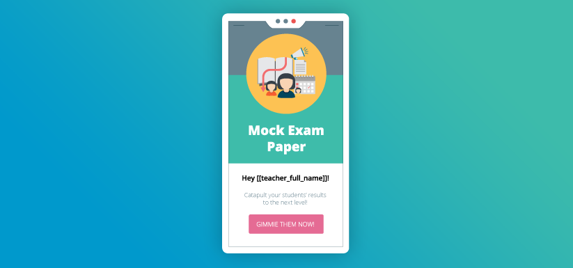
However, on rows with multiple content boxes, you can now tell the builder not to automatically stack this content on a mobile, which will in turn give you more flexibility to determine how your emails are going to look on your recipient’s mobile phone:
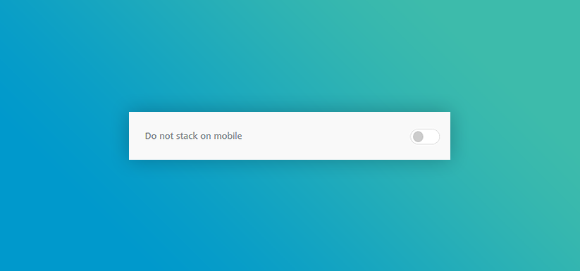
Quick tip - don’t forget to preview and test your emails before you hit send!
3. Row Background Images
Last but most certainly not least, Campus’s Drag ‘n’ Drop builder now has the functionality to have row background images, allowing our clients to create even more stunning emails than ever before.
In the row properties, you’ll see the option to switch on a row background image:
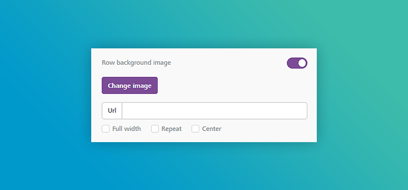
With this new tool, you can advance the email design so much further than simply setting a row background colour, or having an image followed by some text/your call-to-action button below. You can now set a background image and add your content on top of it:
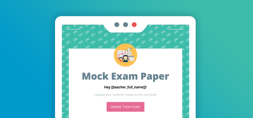
With the additional functionalities of making the image full width, repeated, or centred, the builder really has become your canvas for the ultimate digital masterpiece.
Quick, jump back into your Campus account and let your creative mind run wild!
Tags
Campus
Design
Email
Email Design
Email Marketing
HTML Email
Similar Articles

Our User Support is Getting Stronger
Our Campus support team gives our users a competitive edge, and we're honing that edge with slick new in-app support features.
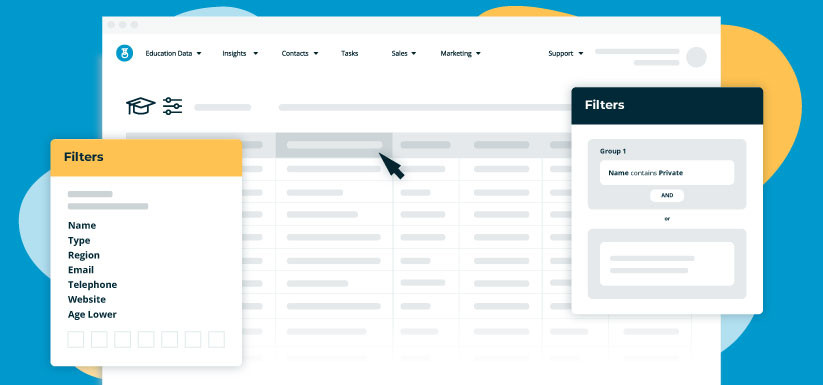

Campus Update: Enhanced List Building for Education Marketing
Targetting schools and teachers in the UK just got simpler, discover our versatile new list builder


Expert marketing to schools support and solutions
Expert marketing to schools solutions
Email Head Teachers, Teachers, and Staff Inboxes
Email teachers and staff inboxes
Sell More to UK and Global Schools and Colleges
Sell more to schools and colleges


