


14 Ways to Increase your Click-to-Open Rate
14 Ways to Increase your Click-to-Open Rate
In this article, we’re going to look at the 14 most important actions you need to take with your next email design to improve your click-to-open rate.
In this article, we’re going to look at the 14 most important actions you need to take with your next email design to improve your click-to-open rate.

There are a couple of different metrics that email marketers use when measuring their campaign clicks: Click-Through Rate (CTR) and Click-to-Open Rate (CTOR).
A CTR measures the percentage of teachers that click a link in your email against the number who received the email. In contrast, a CTOR measures the percentage of teachers that click a link in your email against the number that actually opened it.
In this article, we’re going to focus on CTOR, not just because that’s what Campus measures, but also because it’s the most useful metric for providing insights into your content’s performance (it doesn’t get skewed by open rates). In this article, we’re going to look at the 14 most important actions you need to take with your next email design to improve your CTOR.
#1: Create Great Content to Underpin your Email Campaigns

Often, the reason why an email campaign to teachers generates a particularly high CTOR isn’t actually to do with the content of the email at all; it’s a result of the great content you are linking to on your website. This might be a free report, a webinar, a free lesson plan, or a blog article; the important thing is that it’s a piece of content that gives your audience great value without requiring much of them in return.
At Sprint Education, when we’re working on our email marketing campaigns, I would say that 90% of our time and effort goes into the creation of whitepapers or blog articles like this one, with only 10% of our time spent writing and designing the emails that will promote them. That’s because we know that if we can promote some great content, it’ll make the job of achieving a good CTOR much easier.
Being able to promote great content also makes the task of creating your email so much simpler. After all, if you’re promoting a great piece of content, then you don’t need to work too hard to promote it; you can just let the content speak for itself.
On the other hand, you’ll often find that writing and designing an email when you don’t have a great piece of content to promote is extremely hard work. You end up trying too hard, saying too much, because you know that it’s going to be tough to persuade your audience to click your link. That desperation almost always manifests itself in the form of a flabby and unfocused email that underperforms.
#2: Align Your Call to Action with Teachers’ Positions in Your Sales Funnel
When we talk about a teacher’s position in your sales funnel, we’re really talking about the type of relationship you currently have with them.
For our Campus users, that means whether they are a teacher who has never engaged with you before (in which case they’ll sit within the Education Data module) or whether they are a teacher who has already started developing a relationship with you by clicking a link in an email, subscribing to your newsletter, requesting a quote etc. (in which case they’ll sit within your Contacts module).
I know it sounds simple, but the biggest mistake sellers to schools make is to ask these different types of contacts to complete the same kinds of action. To give a crude example, there is little point in asking a teacher to subscribe to a paid plan of your online learning software – no matter how great the discount is – unless they have already watched a video, attended a demo, or started a free trial for example.
You can try, but your CTOR is going to be poor because you’re asking teachers to make a purchasing decision before they’ve had the chance to gather the information they require to make it. Before you send your next email campaign, think about whether your expectations are reasonable.
#3: Stick to One Call to Action Button
When we talk about a call to action in terms of email marketing design, we mostly mean a button within your email that takes teachers off to a specific page on your website (to watch a video, download a free report, request a quote etc.)
It’s going to be tempting to have a secondary call to action in your email, almost like a backstop, in case teachers are not ready for or interested in your primary call to action. However, in most cases, this should be avoided.
Introducing a secondary call to action will only dilute your message and make it less compelling while also introducing an element of choice into your email, which could risk confusing a busy teacher who wants you to lead them clearly towards the action you want them to complete. This is often referred to as ‘choice overload’ or ‘choice paralysis’.
If you have to include a secondary call to action, make sure this information only comes into play beneath the button for your primary call to action. That way, everything before that primary call to action button is focused solely on giving teachers reasons to click that button.
#4: Focus all Content on Achieving One Call to Action
Once you’ve decided what you want teachers to do with your email (and you’re happy that what you’re asking them to do is reasonable and aligned with their funnel position), the next task is to make sure that your email’s content focuses solely on achieving that outcome.
Again, it sounds simple, but this is a mistake we all make from time to time. It’s one of the main reasons why our email content often ends up looking flabby and unfocused. We want to say too much.
If you’ve decided that your email is going to focus on encouraging teachers to view a case study on your website, make sure that every single word in that email contributes to making teachers want to click-through to read it.
There’s no point talking about pricing, sharing testimonials, or even giving them the background to your company. You’re not selling your company at this point; you’re just selling your case study. Make sure every word in your email goes towards making that case study as intriguing and as appetising as possible.
#5: Choose Your Button Text Wisely
The first thing to do is avoid button text that is too pushy or infers a high level of commitment, such as “Buy Now”. Instead, make sure that you use actionable copy that conveys excellent value, such as “Download Your Free Report”, “Schedule Your Demo”, or “Access Your Free Lesson”.
Use verbs at the start of your button text to encourage teachers to take action and make sure the text makes sense in and of itself. A teacher should read the text on your button and understand straight away what they’re going to be getting by clicking. You don’t want them to have to read all the preceding text before your button makes sense to them.
Remember that not all of what you write in your marketing email will be read by teachers. They’re busy people, and they will often skim-read. The two parts of your email that they are most likely to read will be the header (by which I mean the big, bold text at the top of your email, like a newspaper headline) and the button text.
Therefore, you need to make sure these two parts of your email act as a tag-team. This makes your email “snackable” so that a busy teacher can still understand exactly what you want them to do, even if they don’t have time to read your email in full.
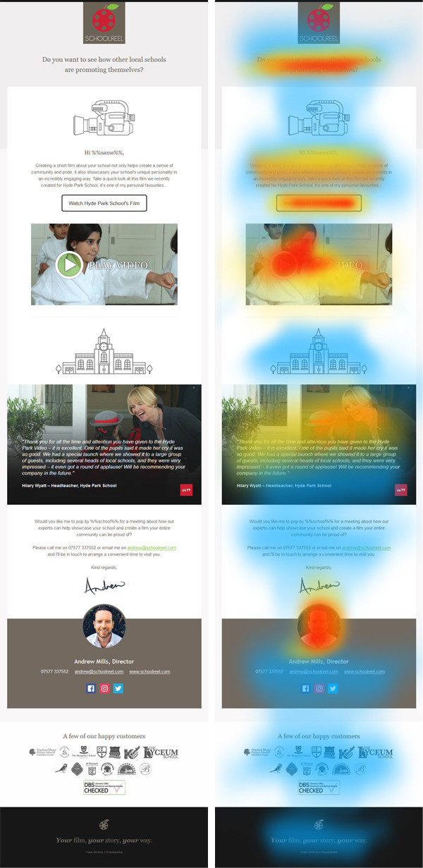
For example, for one of our clients, we used a header that read, “Do you want to see how other local schools are promoting themselves?” and button text that read, “Watch Hyde Park Schools’ Video”. Any teacher that only read those two sections in the email still understood exactly what the email was about, what they needed to do, and why.
Here's a heat map showing where readers' attention is drawn to in this client's email example:
#6: Don’t Sell Yourself Short
One of the most common mistakes education businesses make is under-selling their call to action. Take a 30 day free trial of an online study platform as an example. The phrase “Free Trial” is one of the most ubiquitous in the world of education marketing. It’s used so often (and to describe such a wide range of things) that it’s become almost meaningless.
It also implies very little value. When I hear the words “free trial”, I immediately think of a portal that’s going to give me very restricted access and very restricted functionality, something that’s going to show me how great the content is while simultaneously preventing me from actually getting any benefit from it.
In short, I picture a free trial as something that works for you but doesn’t work for me, so I’m not inclined to investigate further.
We recently designed an email for one client that tripled the number of clicks through to their free trial sign-up page by not referring to it as a free trial at all. Instead, we promoted it as free access for 30 days to a host of free online resources that a teacher could use with their pupils to help achieve X, Y and Z.
Think about some other calls to action you might use and how you might be selling it short.
#7: Hold Some Things Back and Don’t Say too Much
I drew a comparison with a newspaper headline in one of my previous points, and that’s a pretty useful example when we’re looking at improving your email’s CTOR. Newspapers, in particular tabloid newspapers, are incredible at coming up with front pages that make us want to grab a copy off the shelf and flick through to read the full story.
How do they do that? Usually by holding the details back and creating a real sense of intrigue around a particular story. Think of your email in a similar way.
For example, if your email’s call to action is to download a case study on your website, think about what information you need to share in your email (to make them want to read it) and what information to hold back (to make them have to click through to read it).
This usually means sharing the challenge the school faced, sharing an attention-grabbing statistic about the result they achieved, but holding back everything about the solution you provided them to achieve that result. Create a sense of intrigue around how the school achieved this fantastic result – don’t give them so much information that they no longer need to click on your link.
#8: Segment Your Audience to Ensure Greater Relevance
You might be a company that sells to all different segments of the UK education sector. You may provide similar products or services to all school types, whether they are nursery, primary, or secondary; state, independent, academy or grammar. However, it’s essential that you create multiple versions of your email design, adapted to each mini-segment.
Take our earlier example of a case study being your call to action. Do you want to promote the same case study to every school, or do you want to hand-select a specific case study based upon the pupils’ age range, the type of school, its geographic location? If you can promote a case study of a school that is a close fit with the school you’re emailing, then you will almost certainly get a better CTOR.
Try matching job titles, too, so that you’re sending Deputy Heads, for example, a case study featuring one of their peers. And, if you’re a Campus user, you can even try using the context data (% of FSM students, size of the school, premises spend per pupil etc.) to make your messages ultra-relevant to your audience.
It’s a bit more extra work than sending the same campaign to everybody, but your hard work is sure to be rewarded with an improved CTOR.
#9: Highlight Scarcity or Limited Availability
Highlighting scarcity in your emails is a great way to trigger the fear of missing out (FOMO) and, therefore, a handy tool in improving your CTOR.
For example, if your call to action is to sign up for a free webinar, it won’t do any harm to highlight any limits to the number of people that can attend. Or, if you’re offering to visit schools to deliver a free assembly, then putting a limit on the number of free assemblies you can offer each term is a good way to stimulate interest (while also giving you an out in the case that you can’t keep up with demand).
Highlighting time limits or scarcity is a really useful tool in encouraging teachers to click your call to action button now instead of simply filing away your email for later.
#10: Try to Ensure Your Button is ‘Above The Fold’
When we say “above the fold”, what we mean is the part of your email which is visible to a teacher when they open it. So, the key here is to make sure that teachers can see your call to action button without having to scroll down.
With 59% of teachers now opening emails on mobile devices, where scrolling is easy and very natural, this point is not quite as crucial as it was two or three years ago.
However, that still leaves 41% of teachers viewing your email on desktop. Remember what we said earlier about trying to ensure your email’s header and button work together as a tag-team? For that to work, it’s still advisable that your button is above the fold and visible when a teacher opens the email.
The ‘fold’ will be in a different place depending on exactly what device is being used. Still, as a rough guide, I’d recommend having header images no taller than 400px and opening paragraphs no longer than 50 words.
#11: Draw the Eye to Your Button
Clicking your call to action button is what you want teachers to do above all else, so it needs to stand out. There are a few simple ways you can do that.
Avoid using colours for your button that blend in too seamlessly with the colour scheme of your email. Make sure your button sticks out like a sore thumb and immediately draws the eye. Select a bright colour that won’t be used anywhere else on your email’s design (colourful but without clashing with your background). This will make sure your button really “pops”.
If you need to find a highlight colour that’ll complement – not clash with – your current brand colours, you can use online tools such as Adobe Color (https://color.adobe.com/) to create a palette.
It’s also essential to ensure that your button doesn’t look cramped in amongst all your email’s other content. Give it room to breathe by adding at least 20px of padding all the way around. You can also utilise white space around your button to create a visual break and draw the reader’s attention right where you want it.
Keep the text you use on your button short and snappy (maximum of 5 words but ideally less). The more text on your button, the less ‘clickable’ it’s going to look as it will begin to look less like a button and more like a header (meaning some teachers might not even realise it’s a clickable button).
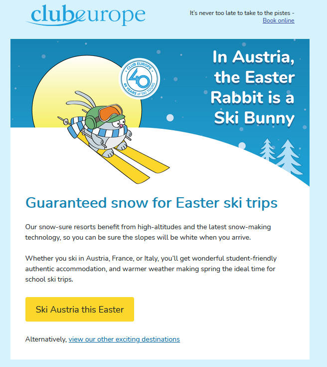
Lastly, is there anything you can do to draw the attention to your button in terms of the design? Take a look at the below example of an email that draws your eye down towards the call to action button (and has an additional button incorporated into the header image so that there is still a button visible before scrolling):
#12: Don’t Embed Buttons or Crucial Information in an Image
Despite the rise of teachers viewing emails on mobile devices, Outlook is still one of the most popular email clients being used in schools. If, as is typical, Outlook is set up not automatically to download your images, any calls to action or essential text embedded in them will not be immediately visible.
Embedding your header text within a header image is a common mistake that sellers to schools make and, in a worst-case scenario, can mean that your most valuable, persuasive piece of copy is not visible at all when a teacher opens your email. Instead, they may be faced with a big white square with a red cross in the corner.
Also, avoid using images as buttons for the same reason. Email Designers can be very picky about how their call to action button looks, and that can often mean using an image to get exactly the right effect. However, this is a big mistake that may mean your call to action button is not visible at all — a disaster.
#13: Make Sure Your Button is Easy to Click
A ‘bullet-proof’ button works well because it will display in all email clients (even those where images are switched off). It also means that the entire button is ‘clickable’, not just the text within it.
This may seem like a small thing, but it’s pretty essential when you remember that 59% of your education audience will be viewing your email on a mobile device and using their finger or thumb to click your links.
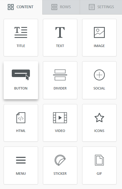
The excellent news for Campus users is that Campus’s Drag and Drop Email Builder makes it easy to use bullet-proof buttons. Drag your button from the Content tab, as per the below screenshot, and alter the settings as required.
#14: Overcome Sceptics with a Plain-Text Style Email
In this article, we’ve mainly focused on the design-heavy style of emails. The ones that look like how you’d normally expect a marketing email to look. And for a good reason: this type of email does generally achieve a higher CTOR than a plain-text style email (an email that looks more like a one-to-one email that you’ve sat and typed out to each specific teacher).
However, all sellers to schools should ensure that they’re not exclusively sending design-style emails. Teachers are the most marketed to people on the planet, and that, unfortunately, means that they can sometimes be sceptical and untrusting of us email marketers. A great way to overcome this scepticism is to send them the occasional plain-text style email that feels more personal and much less ‘salesy’.
Instead of using buttons in your email, or hyperlinking text within your email, paste in the URL of the page you want teachers to click through to. This works well because it overcomes some of the fear teachers may have about clicking an unsafe link – if they can see the full URL, they’re going to be more easily satisfied that the link is safe and, therefore, more likely to click on it.
And, that’s it!
I hope you’ve enjoyed reading this blog, and you’ve learned a few tips and tricks that you can start implementing in your emails to teachers right away. If you want to discuss anything you’ve read in this article or get some feedback on why your email campaigns aren’t generating the clicks you’d like, please email me at john@sprint-education.co.uk. I’ll be happy to help.
Tags
Email Teachers
Marketing to Schools
Selling to Schools
Similar Articles
Selling to Schools in the Summer Term
Explore the insights of over 3,000 school staff and understand how to shape your education marketing during school's biggest spending period.
Marketing Universities to Schools
Learn 10 game-changing insights to make your university a student's first choice by enhancing your education marketing campaigns when emailing schools.


Expert marketing to schools support and solutions
Expert marketing to schools solutions
Email Head Teachers, Teachers, and Staff Inboxes
Email teachers and staff inboxes
Sell More to UK and Global Schools and Colleges
Sell more to schools and colleges
